Amy is a multidisciplinary designer with experience in digital, brand, and campaign design across entertainment, healthcare, and cultural institutions.
Projects
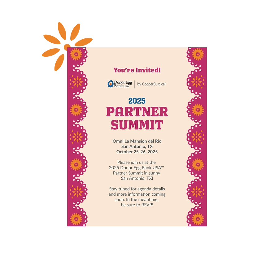
Donor Egg Bank USA
Partner Summit
Event identity and print collateral for healthcare conference.
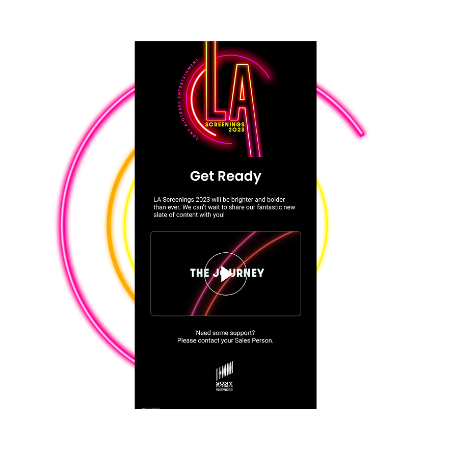
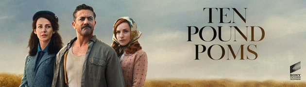
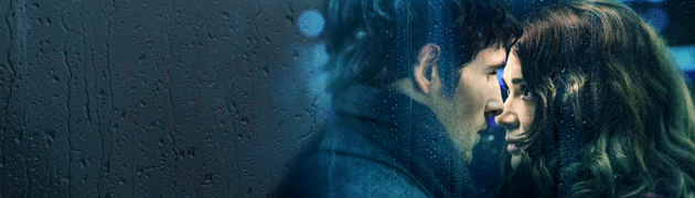
Sony Pictures Entertainment
LA Screenings
Custom Salesforce email templates and animated signatures.
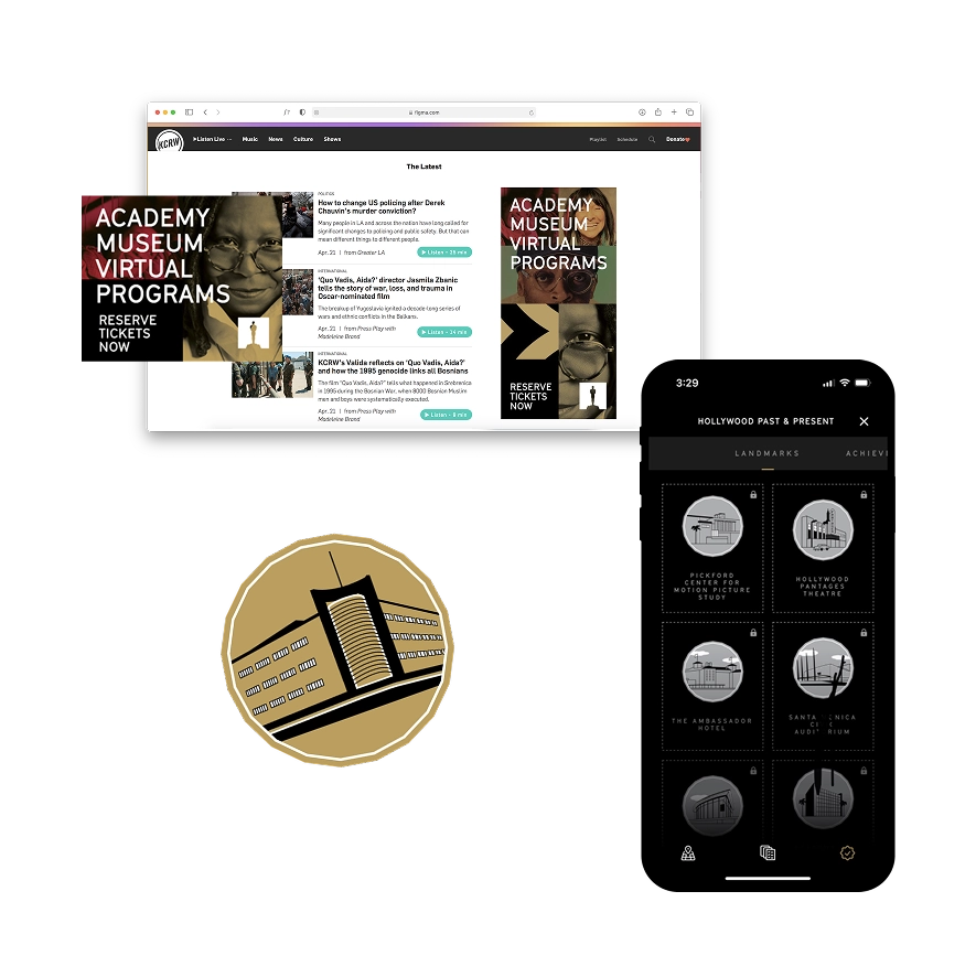
Academy Museum
Inaugural Opening
Paid socials, digital ads, and illustrations for marketing campaign.
Natural History Museum LA
Bug Fair Identity
Logo refresh and key art for the 31st Annual Bug Fair event.
Reikiflo
Website Redesign
End-to-end UX/UI redesign for a virtual wellness practice.
Play
Personal Project
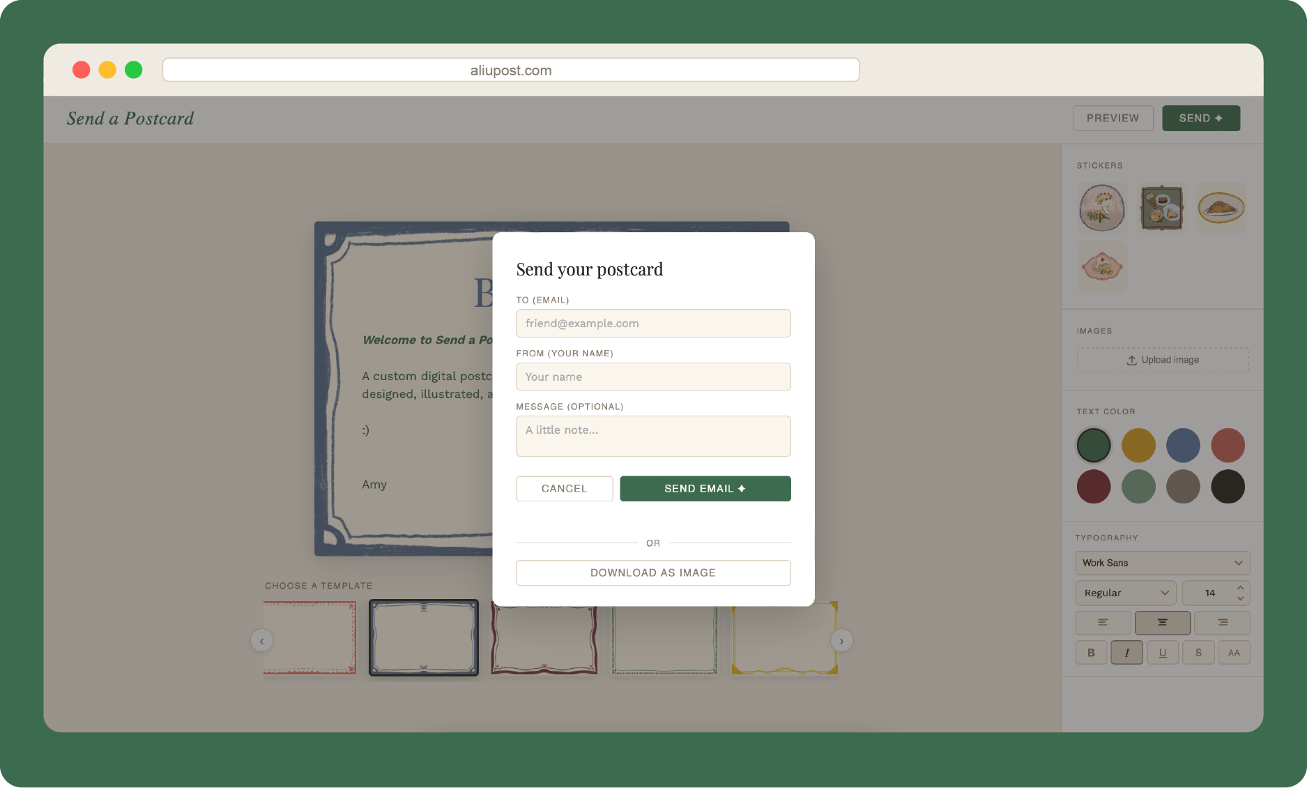
Send a Postcard
A custom digital postcard studio, illustrated and shipped in one day.
Personal Project
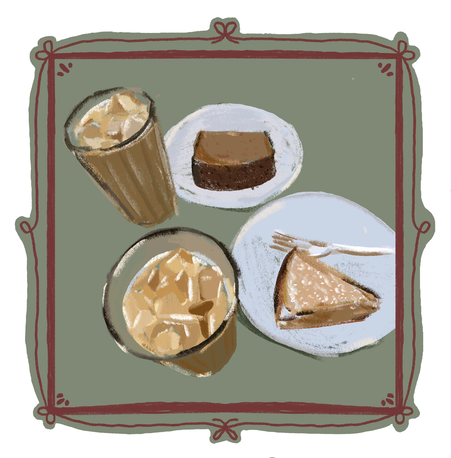
Playing for Boba
Pickleball obsession turned into illustrations.
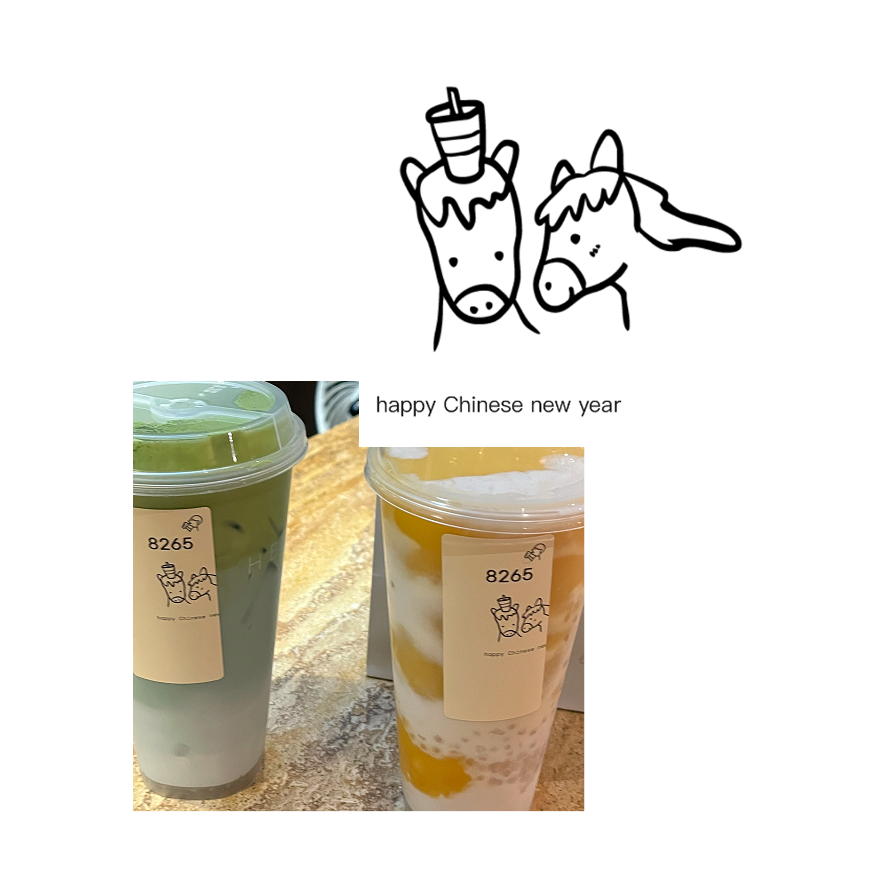
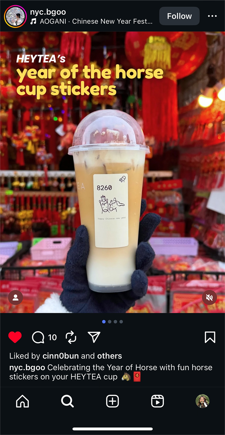
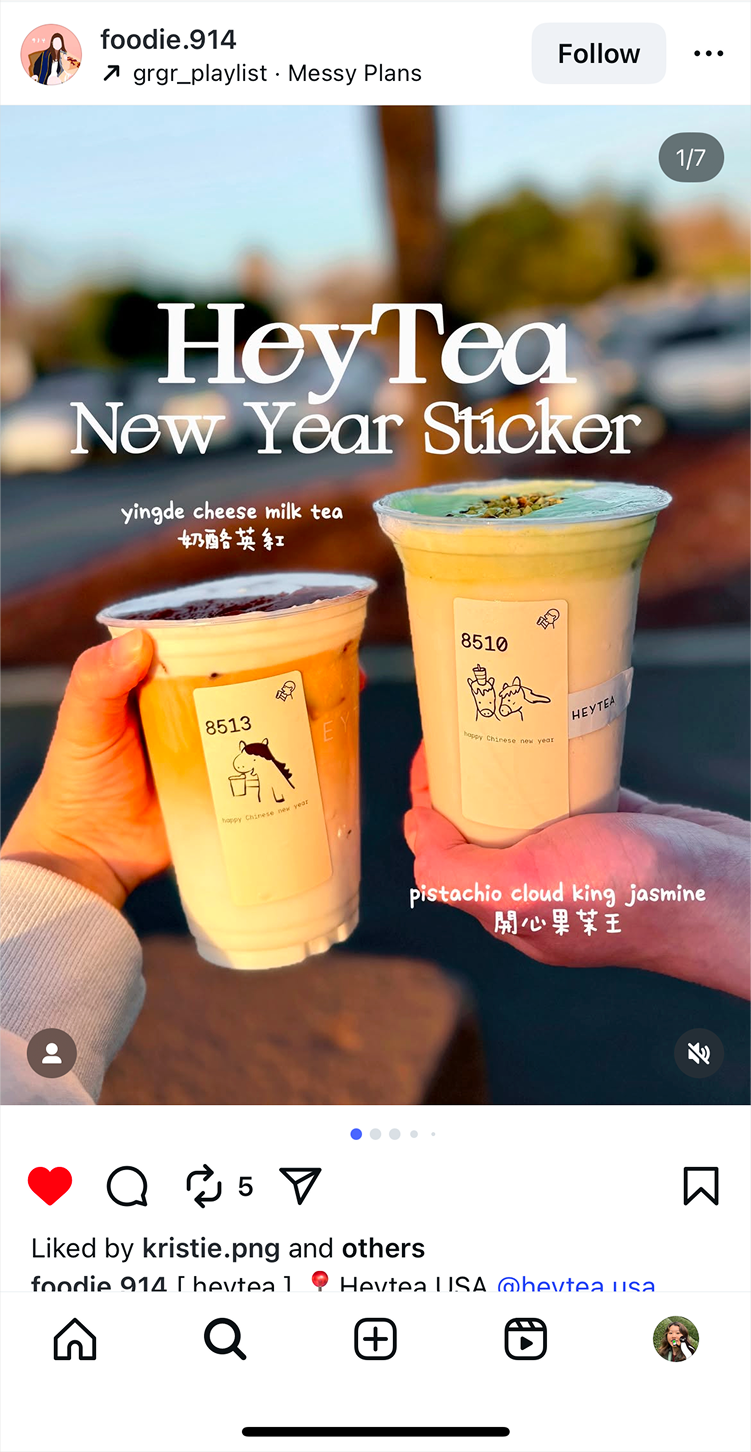
HeyTea
New Year Sticker
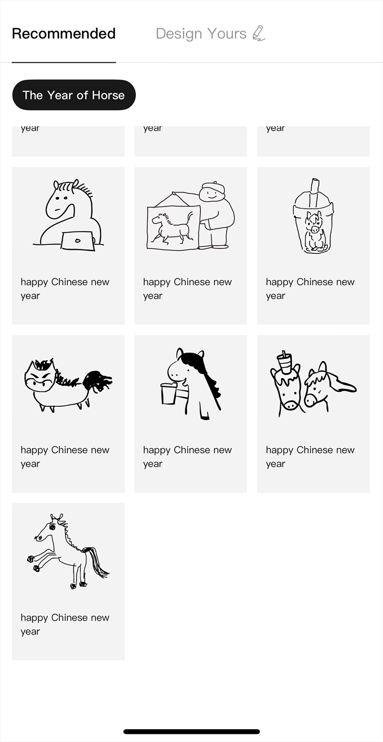
One of 50 sticker designs selected to customize HEYTEA cups.
← Back to play
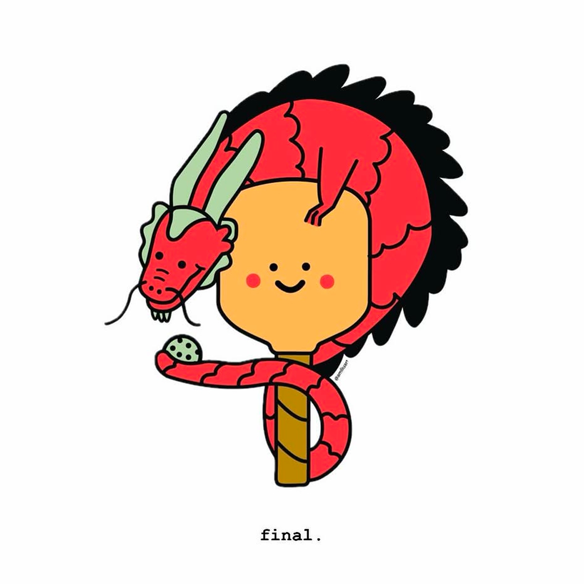
HeyTea
Year of the Horse Cup Stickers
Type
Illustration · Brand Collab
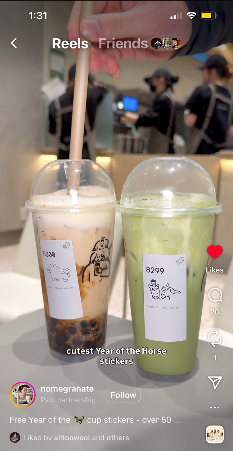
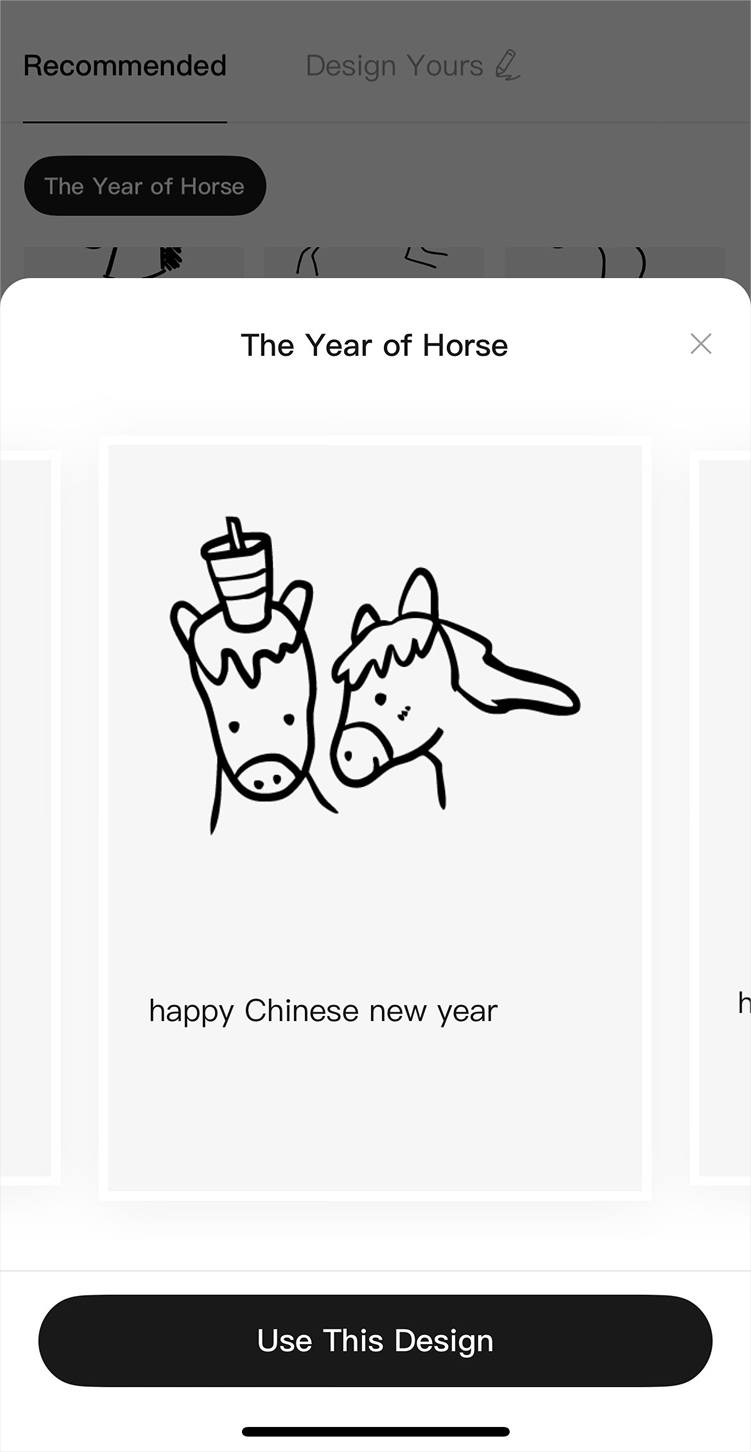
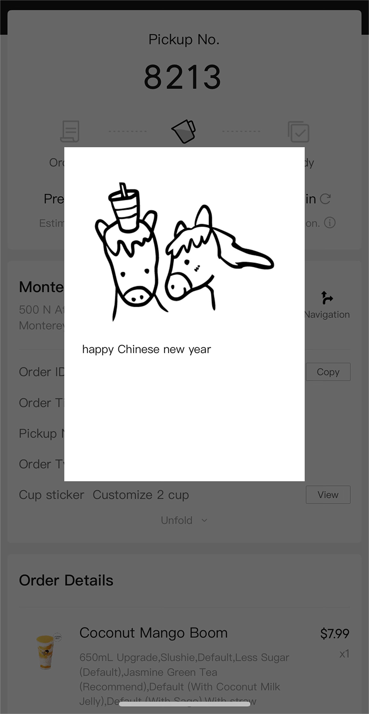
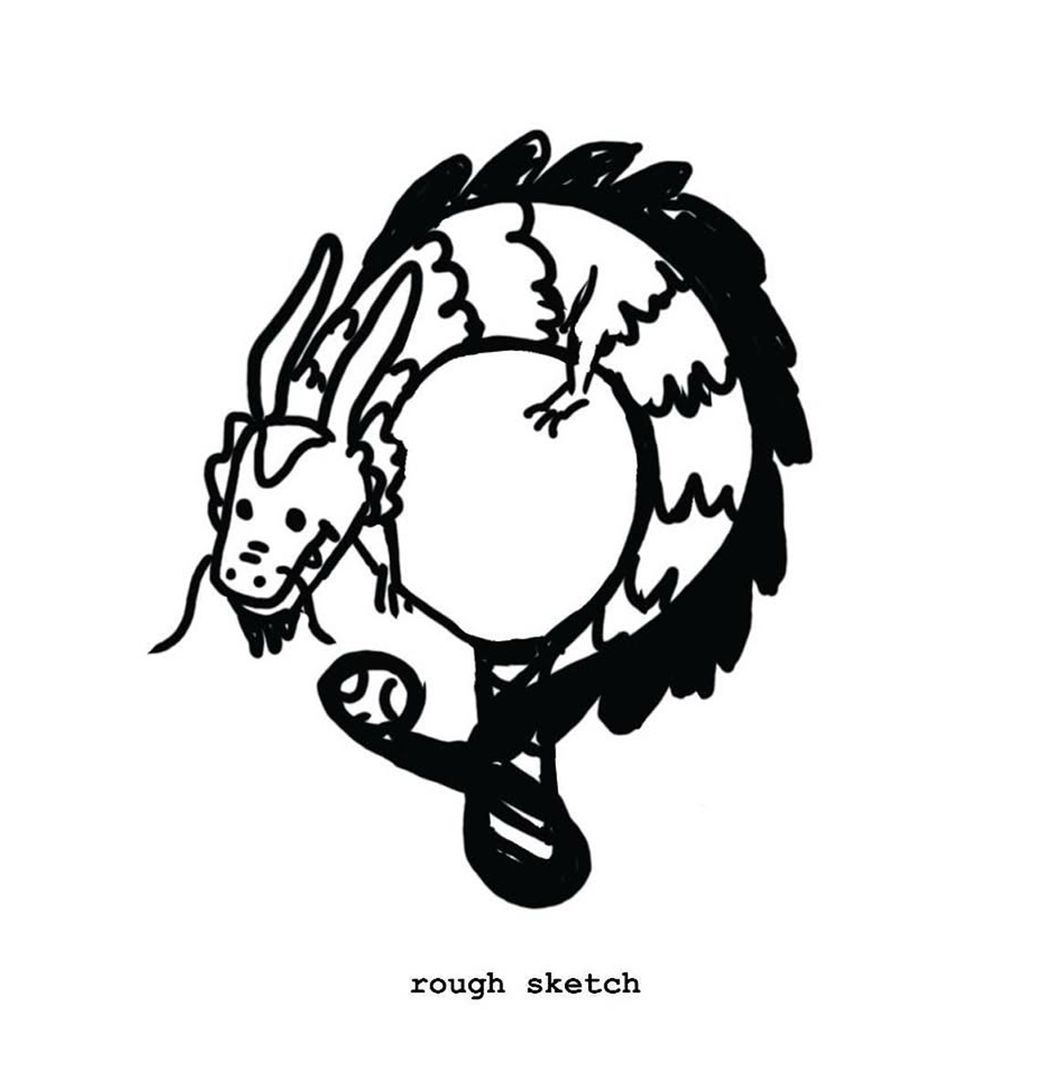
To celebrate the Lunar New Year and the Year of the Horse, HeyTea invited customers to submit horse sticker designs for their cups. Mine was one of 50 selected, available for any customer to choose when customizing their order.
I drew two horses sharing a drink, because the new year is about togetherness and sharing a meal. Simple, warm, and a little silly, which felt right for a cup sticker.
Then one day while doomscrolling, I started seeing my sticker pop up in the wild. Designers and food influencers promoting the campaign kept picking mine out of all 50 options, even though it was listed toward the bottom.
As seen on social
How it works
On the mobile app, after selecting a drink, there's a section to customize your cup sticker. Tap "Customize Now" to browse the available designs and select one before checkout.
← Back to play
← Back to play
Personal Project
Send a Postcard
Type
Illustration · Product Design · Vibe Coding
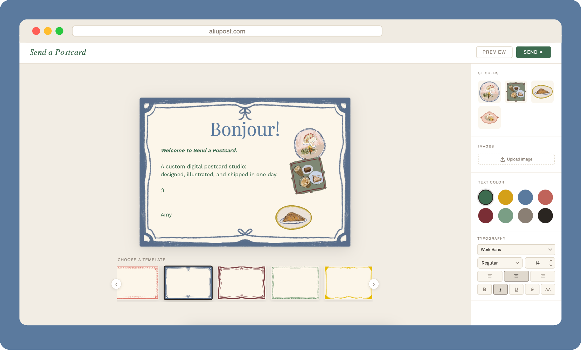
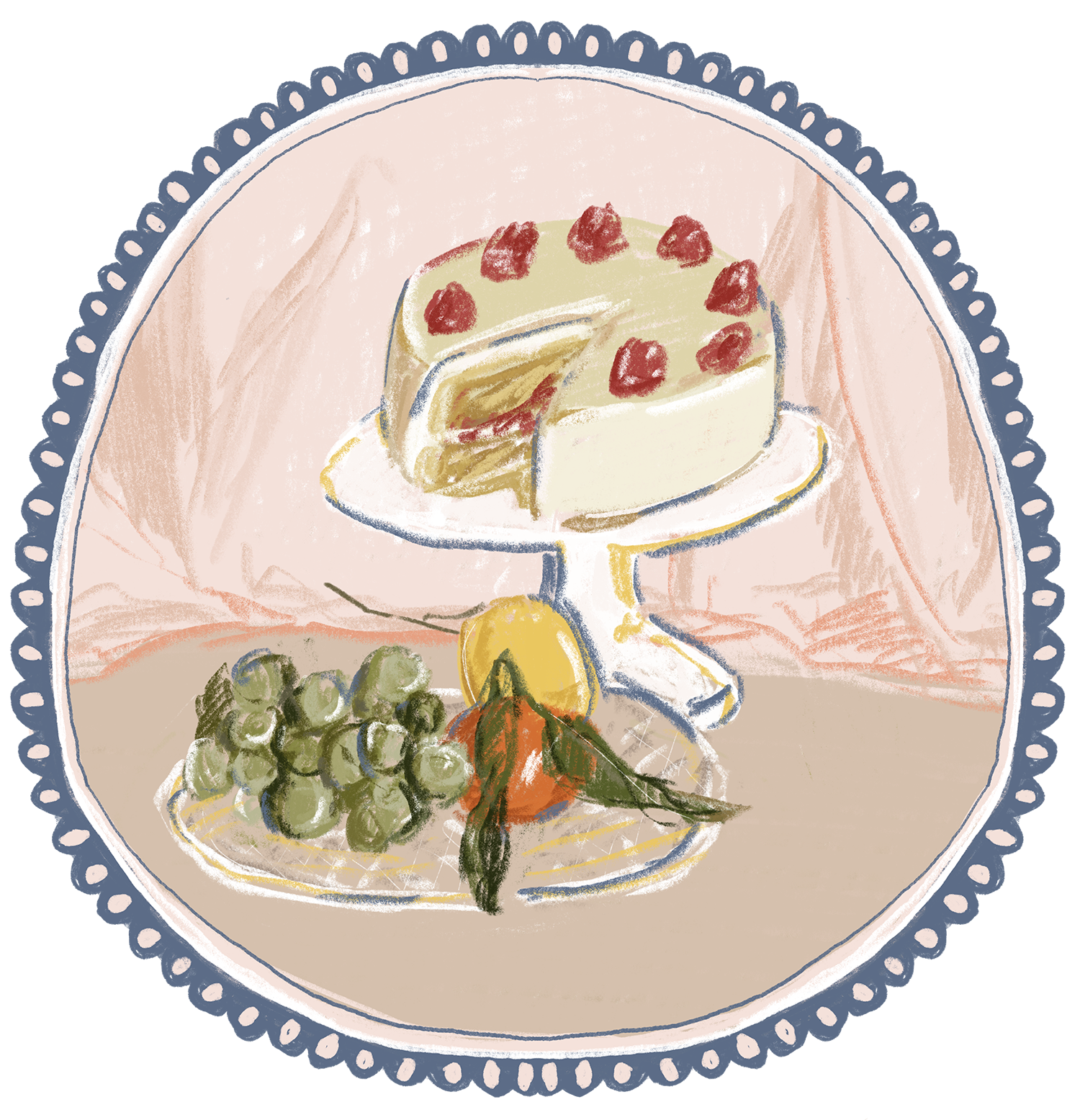
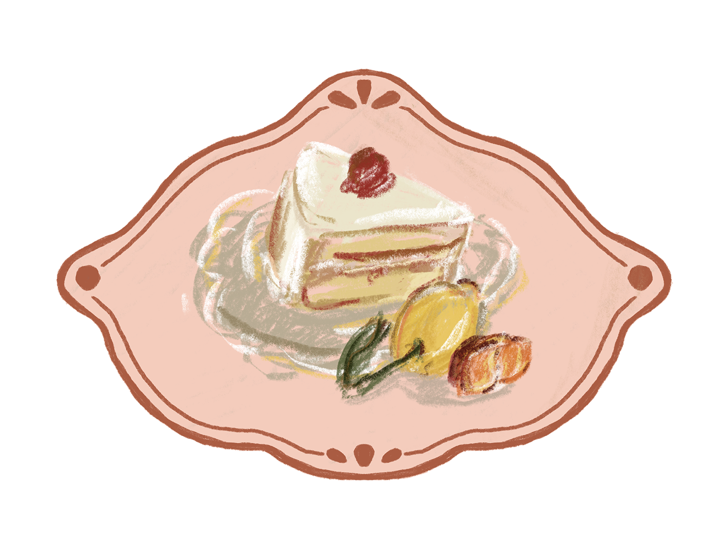
A web-based postcard studio where you can design and send illustrated postcards to anyone's inbox. Every element is custom, from the hand-drawn frames and food stickers to the typography controls and email layout. Built and shipped in one day.
The project started from a conversation over lunch. I was sharing my summer travel plans with friends when someone asked if I could send postcards during my travels. I loved the idea, it felt more personal and precious than sharing stories on social media. Around the same time, I was curious about vibe coding and wanted to try building something real through that process. I knew I wanted to combine something tangible, hand-drawn illustration, with something more technical, building and shipping a product through AI collaboration.
Process
I started with a rough layout: a postcard canvas on the left, a control panel on the right, and a template carousel at the bottom. The goal was to feel closer to a stationery studio than a digital tool.
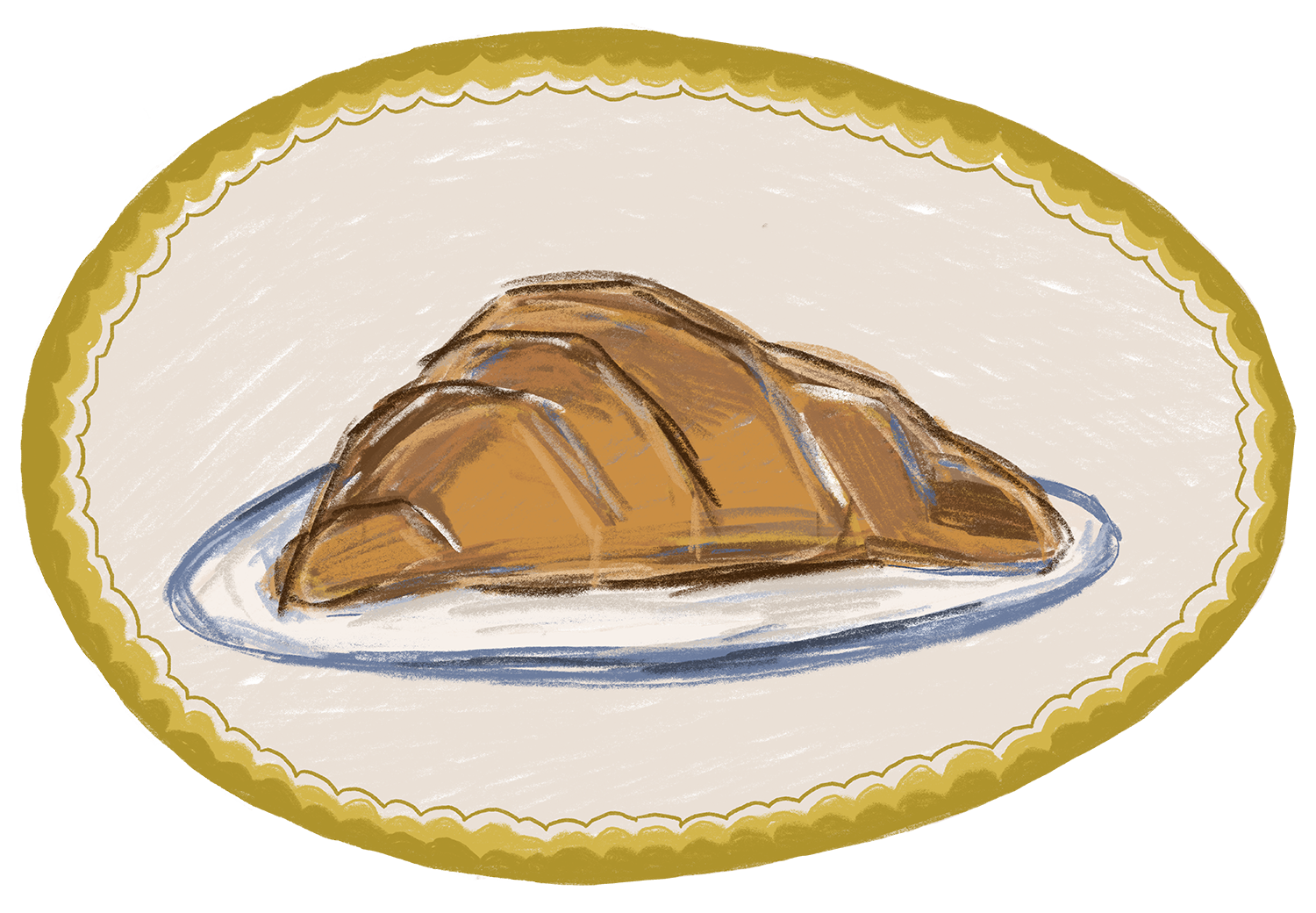
Illustrations. I drew five postcard border templates and four food sticker illustrations in Procreate. I love illustrating pastries and desserts, so I started there, knowing I could expand the library later once the site was shipped.
Scroll to see all 5 templates →
Interface. The UI uses a cream palette pulled directly from the postcard backgrounds, with deep green, rose, and slate blue as accents, inspired by the colors of papers and menus. Typography uses Playfair Display for headings and Work Sans for body, a pairing that feels editorial and refined.
Building with AI. I used Claude as a collaborative coding partner to bring the product to life. Rather than writing code from scratch, the process was conversational: describing what each interaction should feel like, reviewing, and iterating. The editor includes drag-and-drop stickers with resize and rotate controls, inline text formatting, and a custom canvas renderer that captures the postcard exactly as designed.
Shipping. I connected GitHub, Vercel, Resend, and a custom domain (aliupost.com) so the postcard arrives in the recipient's inbox as an embedded image, from hello@aliupost.com. The experience of receiving it is part of the design.
The studio
Takeaways
This project wasn't built by writing code, but by being able to clearly articulate and set a clear vision for building a product. During the iteration stage, Claude would suggest alternative options or interactions, sometimes even distorting images. In that case, I would screenshot and explain what to fix.
Shipping is part of the design process. Setting up the domain, email delivery, and password protection turned a prototype into something people can actually use.
Full stack
← Back to play
← Back to play
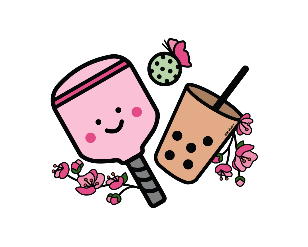
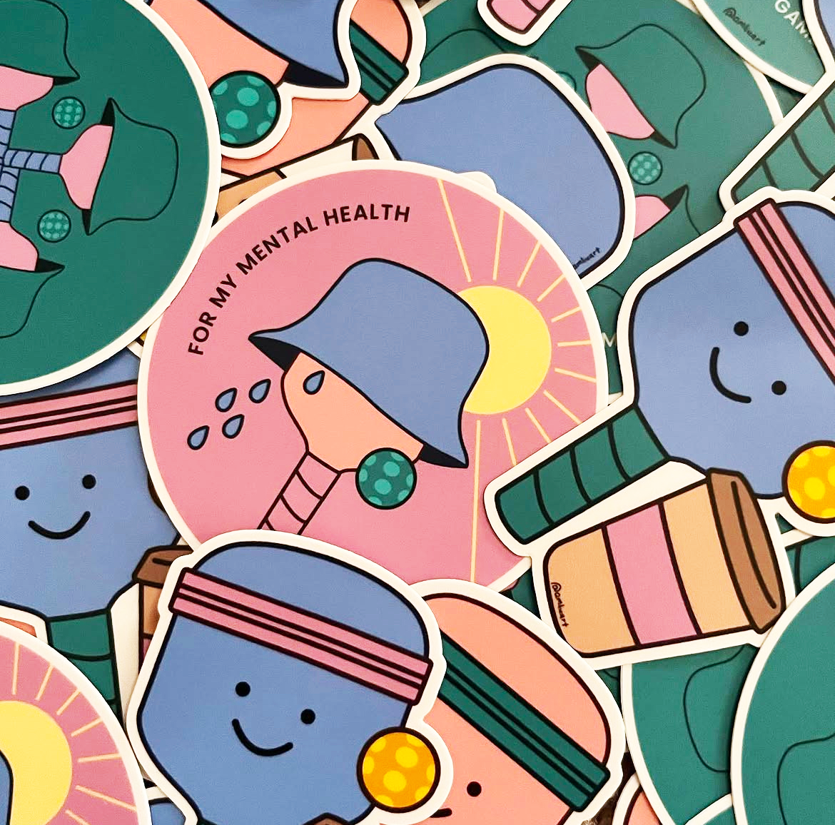
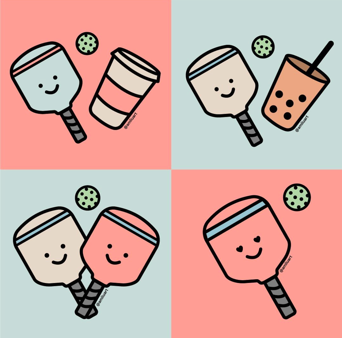
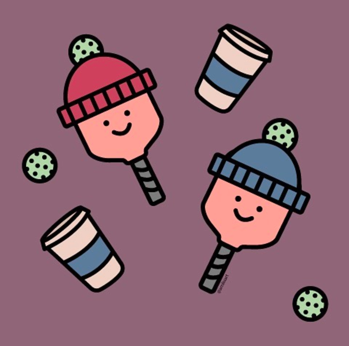
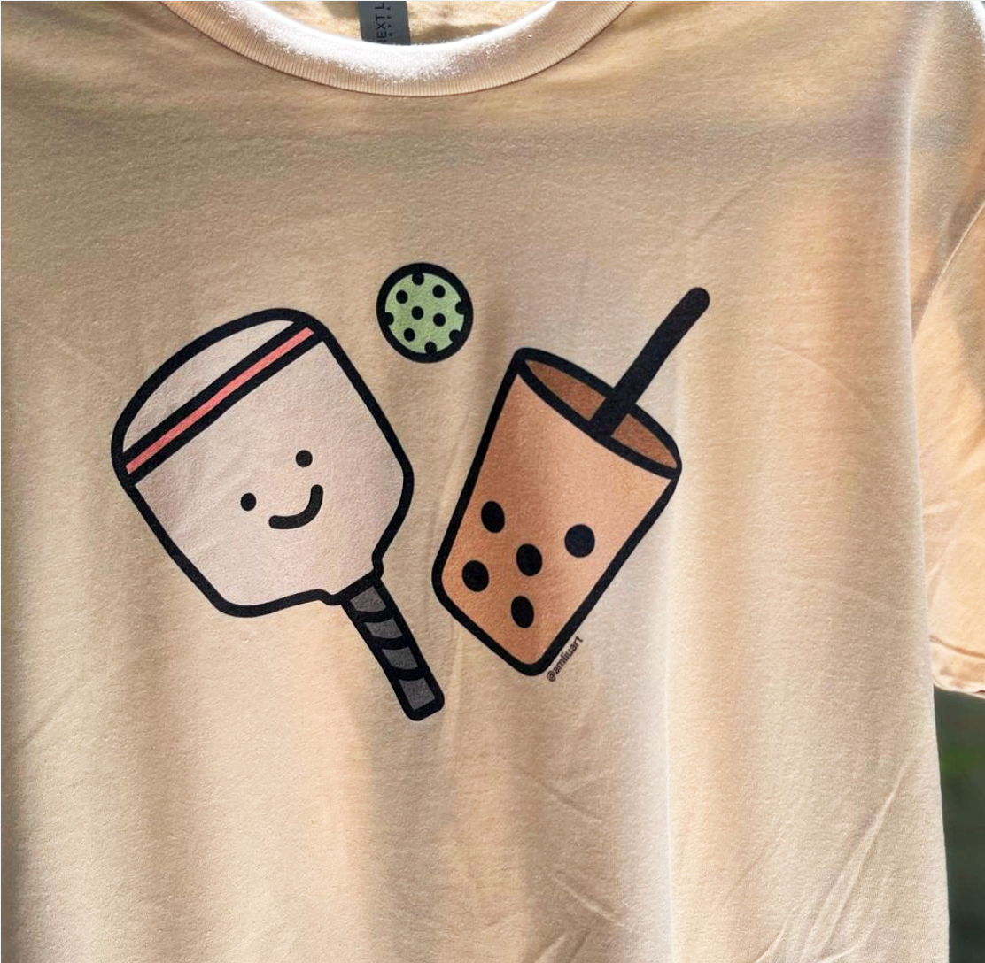
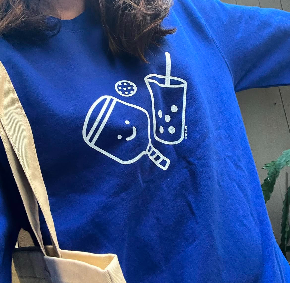
Personal Project
Playing for Boba
Type
Illustration · Merch · Motion
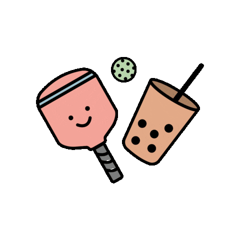
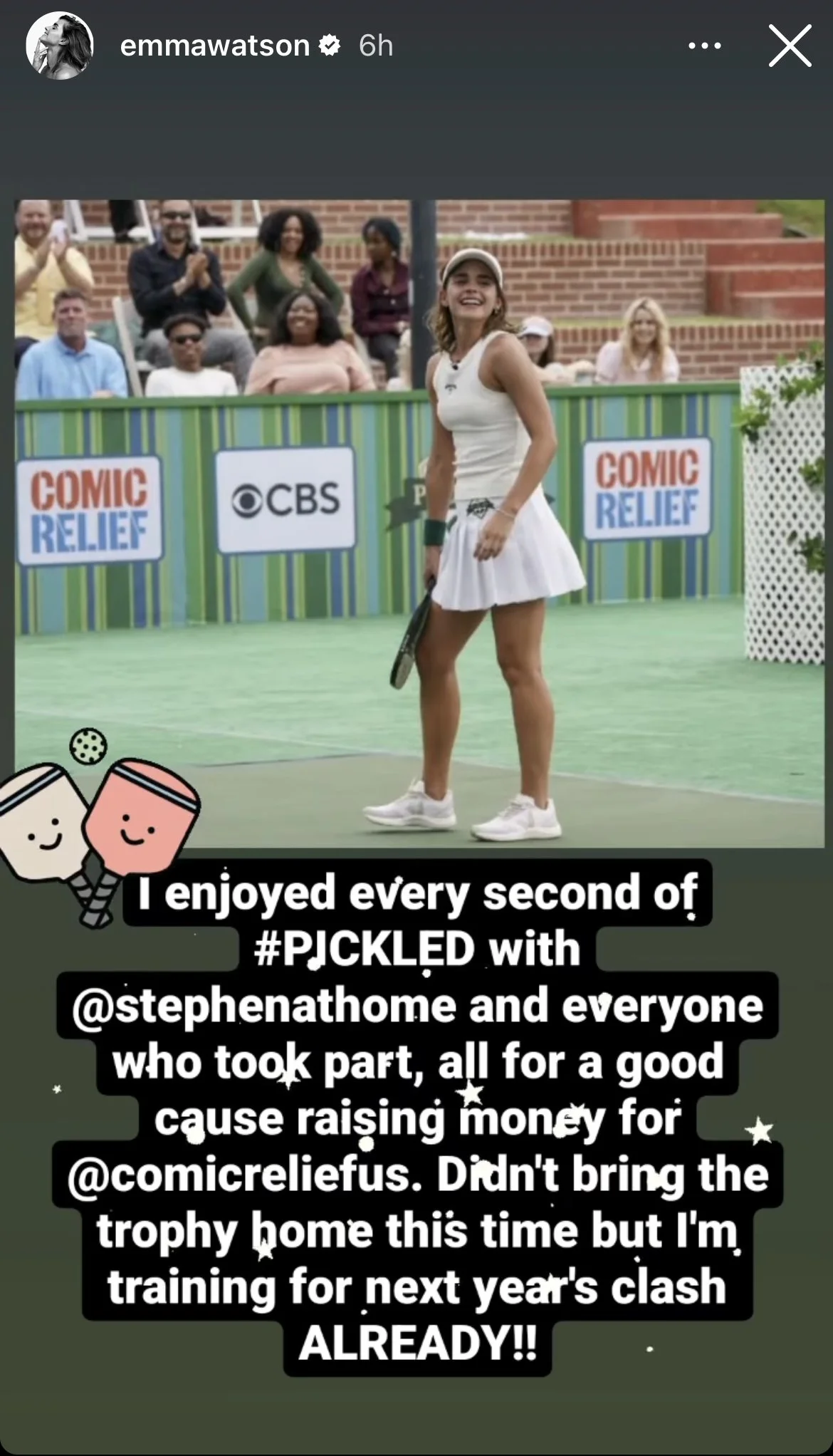
During the pandemic, my friends and I got into pickleball. Competitive enough that we played for boba. I got hooked, and when we couldn't meet, I kept the game going through illustration.
I built a library of custom characters pairing the pickleball paddle with different drinks and seasons. What started as personal fun expanded into t-shirts, sticker packs, animated GIFs, and surface patterns. One of the stickers even made it onto a celebrity's Instagram story.
Illustrations
Merch
As seen on Instagram
← Back to play
I'm Amy, a designer based in Los Angeles. My work spans digital campaigns, email, branding, and UX/UI, with experience across in-house creative teams and independent client projects.
This site was fully built and shipped by me, with the help of my friend Claude. I was one of those designers who was partly intimidated and partly skeptical about AI in design. My previous portfolio was built on a website builder for convenience, but I got tired of the fixed templates and working within their constraints. So I challenged myself to rebuild my portfolio the way I actually wanted it, and the process taught me to communicate more clearly, think like a creative director, and get comfortable with iteration. Pretty incredible to build something without needing to code, just curiosity and creativity.
Outside of work, I enjoy the outdoors, trying new hobbies at least once, and baking. If you'd like to see additional work or discuss an opportunity, reach me on email.
← Back to projects
Donor Egg Bank USA
Partner Summit
Discipline
Print · Campaign · Event Design
Industry
Healthcare
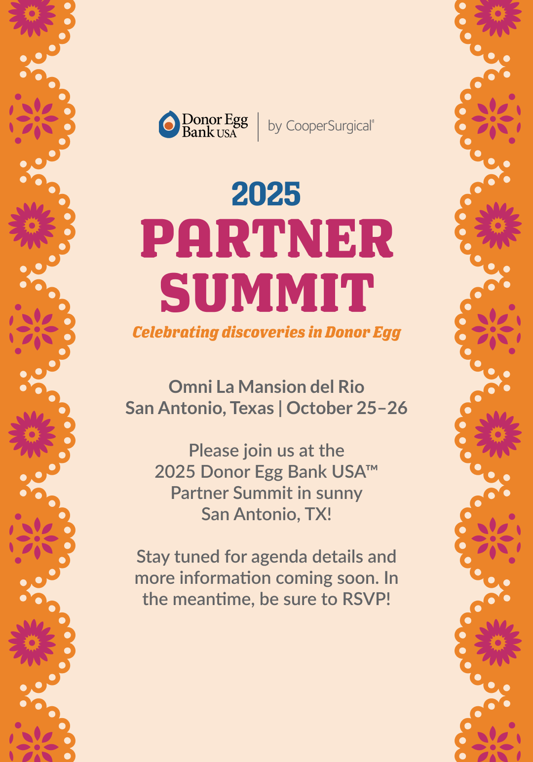
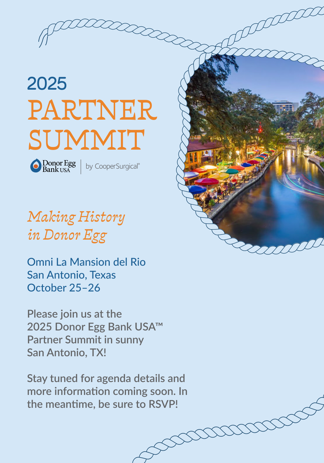
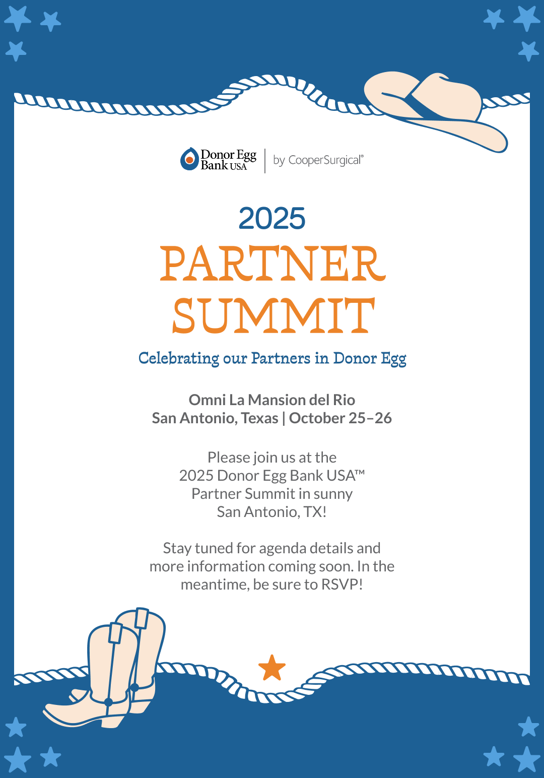
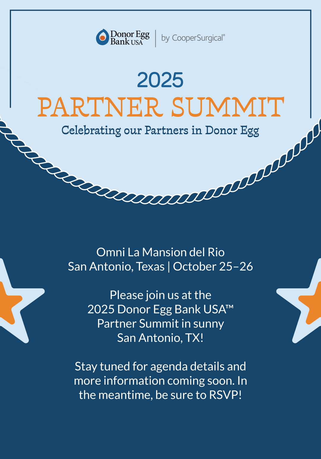
Partner Summit brought together Donor Egg Bank USA's clinical partners for a weekend of best practices and connection. The design challenge: create an event identity that felt culturally rooted in San Antonio while staying aligned with the organization's healthcare brand.
Leading the event's creative direction, I developed three concepts drawing from San Antonio's cultural landscape: from traditional papel picado paper cutting to imagery inspired by the River Walk and the city's Western heritage. The marketing team selected Concept 1, which was then expanded across all touchpoints: print collateral, name badges, signage, and digital assets for presentations and on-screen displays.
Concept 1 — Fiesta Selected concept
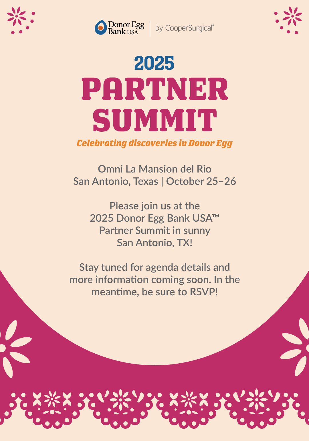
Concept 2 — River Front
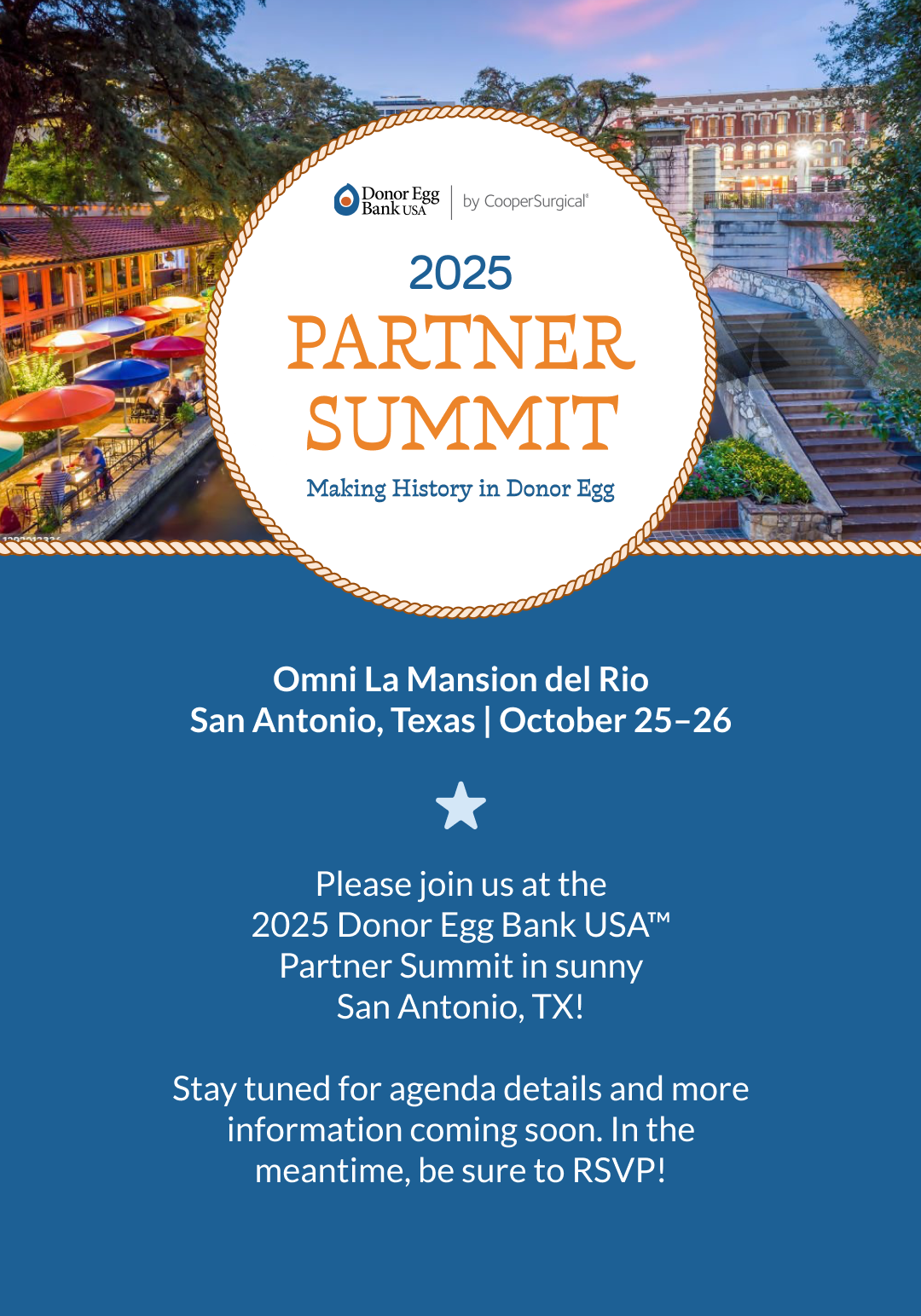
Concept 3 — Rodeo
Next project →Sony Pictures — LA Screenings
← Back to projects
Sony Pictures Entertainment
LA Screenings
Discipline
Digital · Email Design
Industry
Entertainment
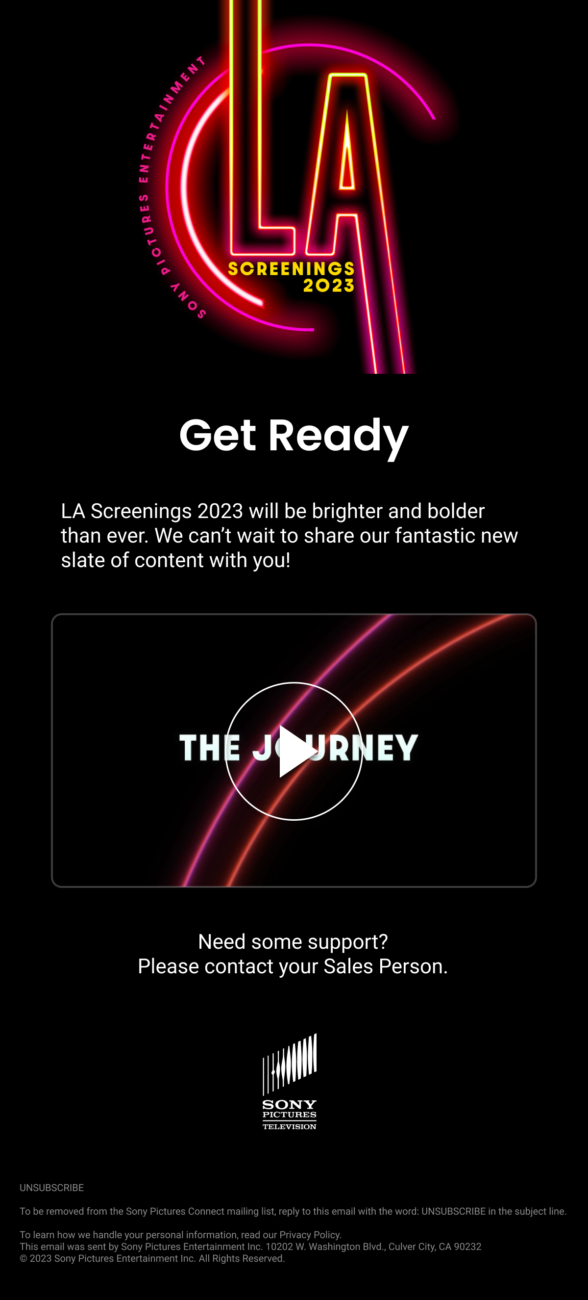
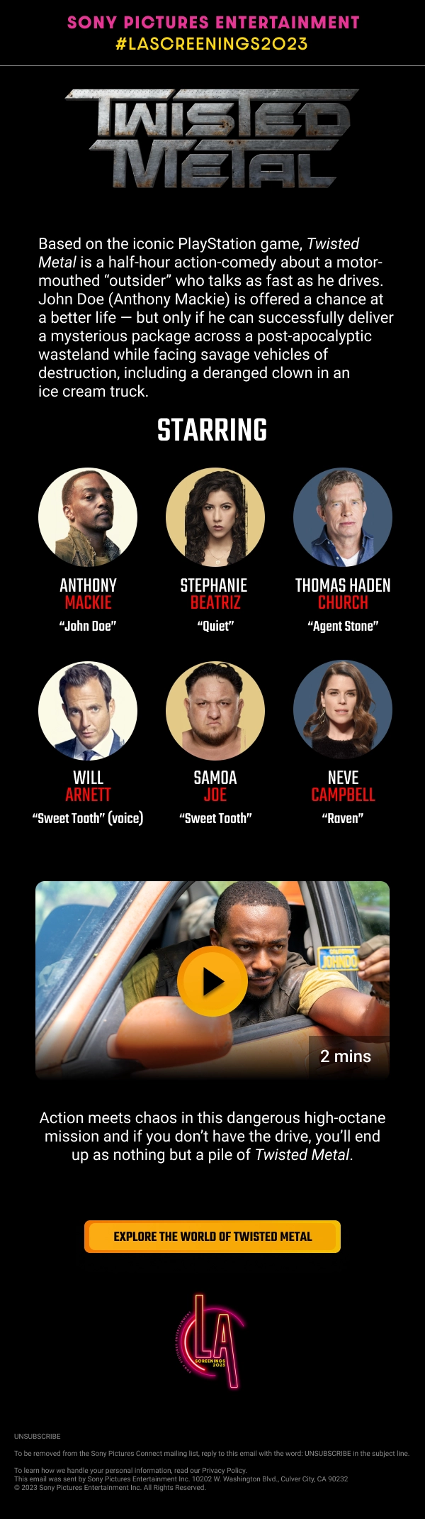
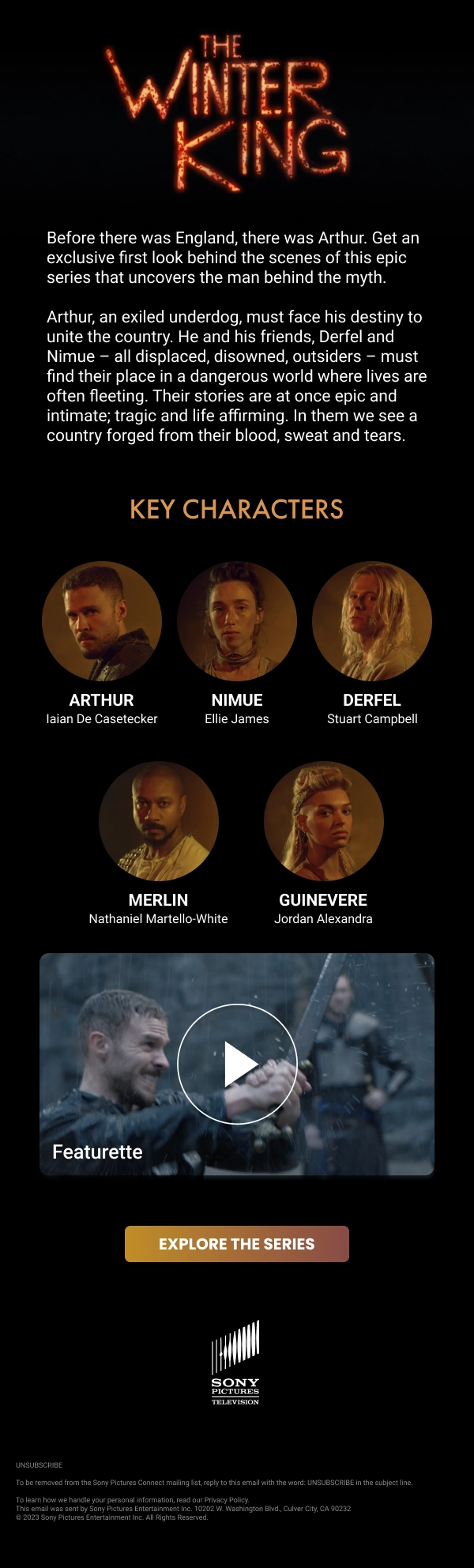
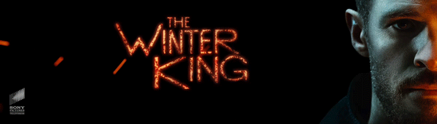
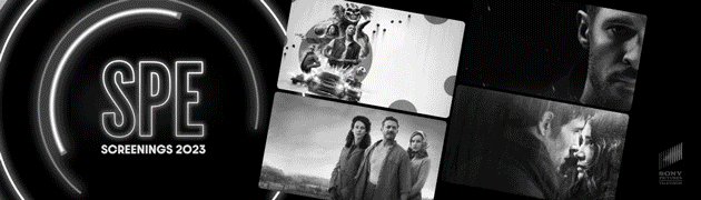
LA Screenings is one of the entertainment industry's most important annual sales events, where international television buyers preview upcoming content from the studio lot. The design challenge: maintain a cohesive event identity while letting each show's distinct aesthetic come through.
I supported the Worldwide Distribution team in creating custom Salesforce email templates and animated signatures for regional sales teams across the event season. Each piece required balancing the LA Screenings event brand with the distinct visual identity of each show title. The team was introducing four new shows that season, each with its own title treatment and branding, and the design challenge was making every asset feel cohesive as a campaign while still honoring what made each show distinct.
Email Templates
Animated Email Signatures
← PreviousDonor Egg Bank — Partner Summit
Next project →Academy Museum — Grand Opening
← Back to projects
Academy Museum of Motion Pictures
Inaugural Grand Opening
Discipline
Digital · Campaign · App Design
Industry
Cultural Institution
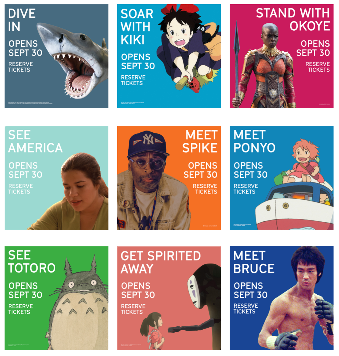
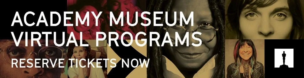
The Academy Museum's 2021 grand opening was one of the most anticipated cultural events in Los Angeles, a once-in-a-generation launch requiring a coordinated digital rollout across paid and owned channels for a global audience.
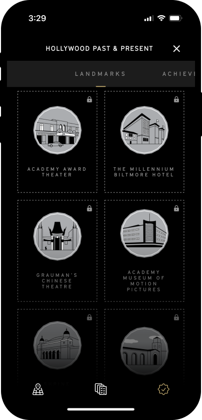
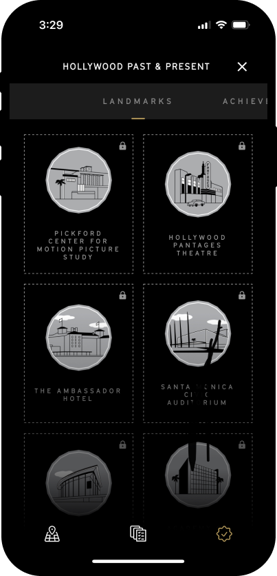
I designed a range of digital assets to build awareness and introduce the museum's brand ahead of opening day. Deliverables included paid social advertising, digital display banners, and custom achievement badges for Hollywood Past & Present, the museum's mobile app feature. For the digital ads, the creative focus was showcasing the variety of objects and programs the museum would feature, a sneak peek to build anticipation ahead of opening day. The interactive app feature invites visitors to discover Los Angeles landmarks and learn about their history. For each destination they visit, they can unlock a custom badge and try to collect them all.
Digital Ads & Banners
Hollywood Past & Present — App Badges
← PreviousSony Pictures — LA Screenings
Next project →Natural History Museum — Bug Fair
← Back to projects
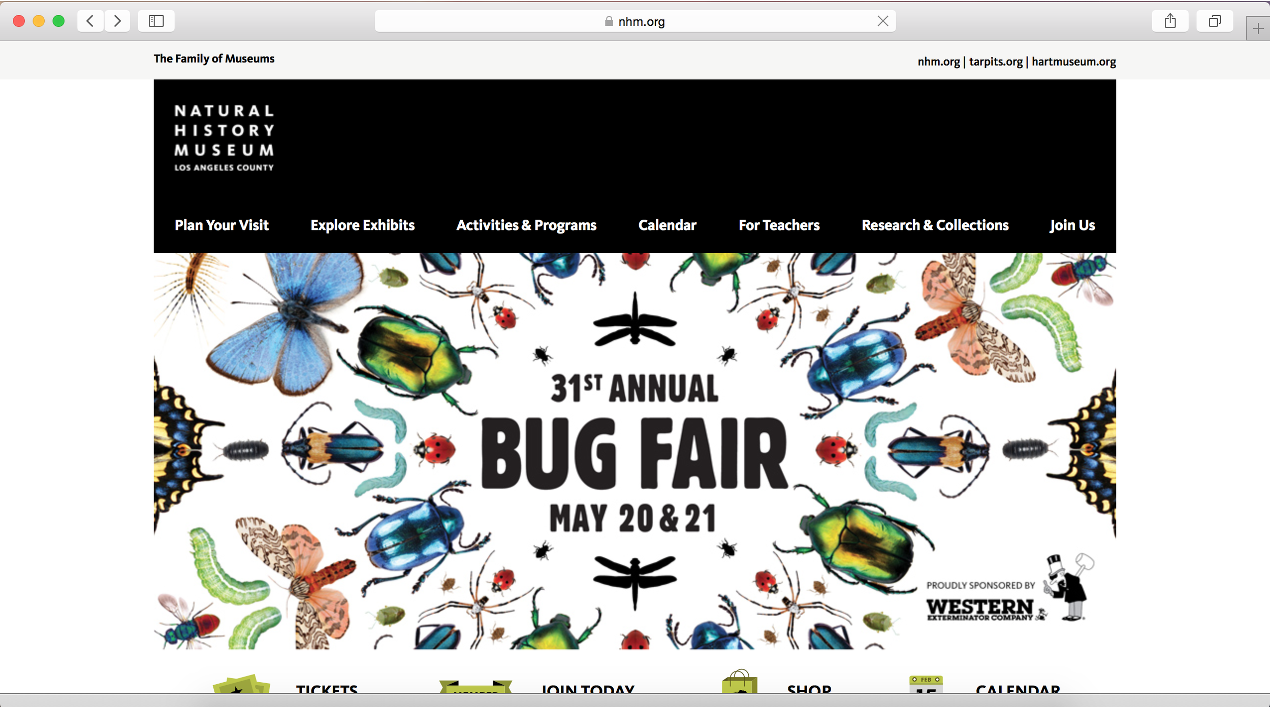
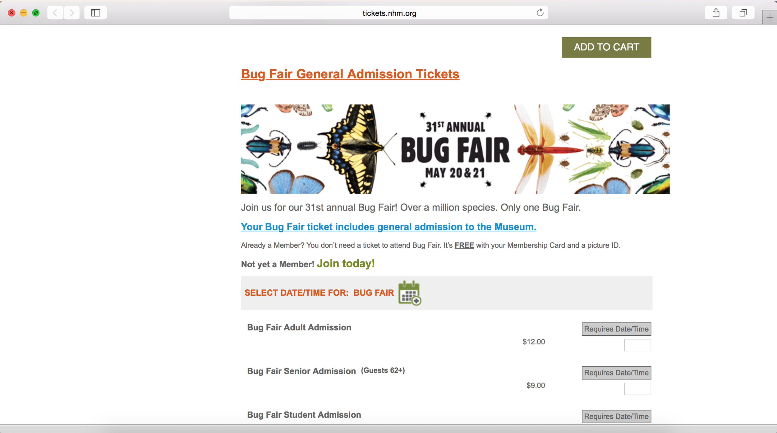
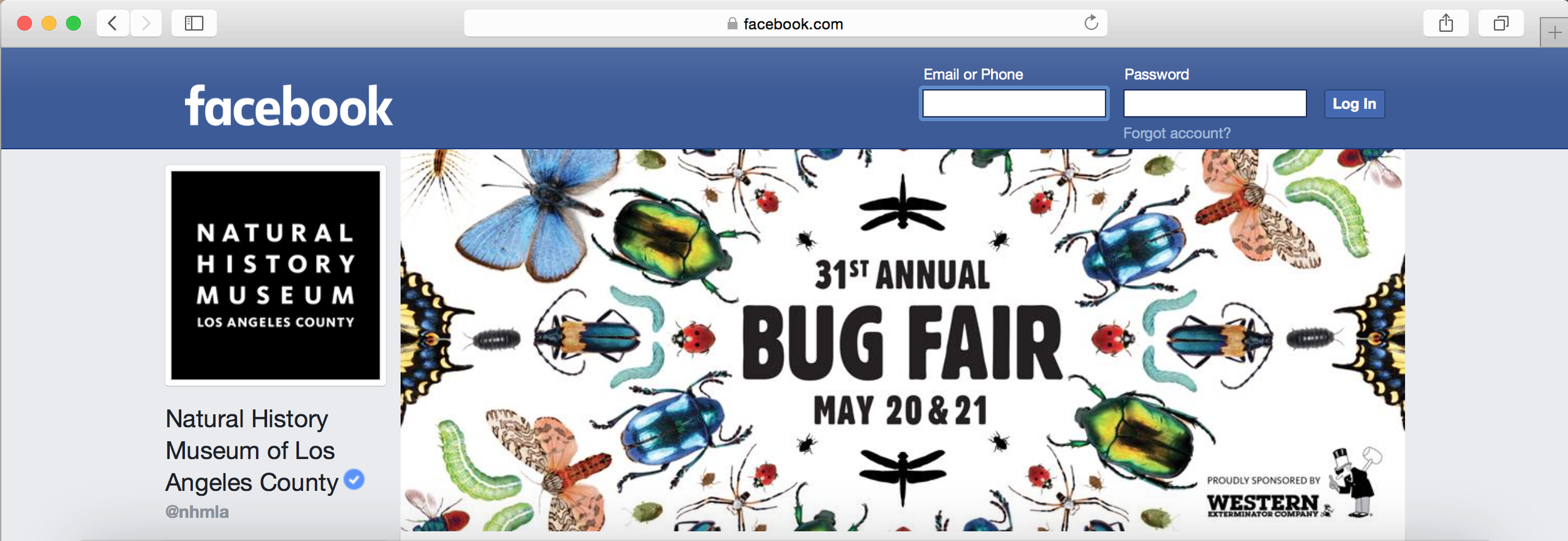
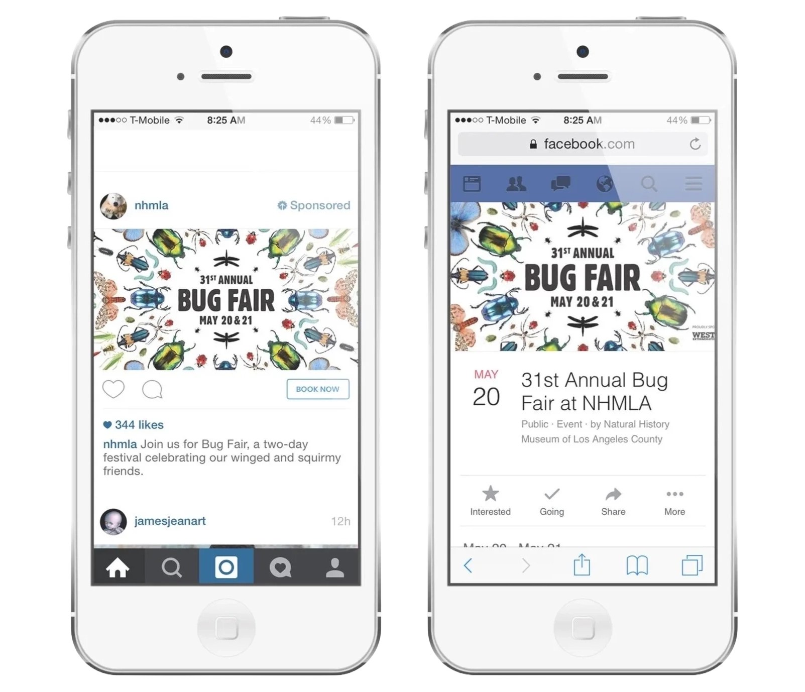
Natural History Museum of LA County
Bug Fair — 31st Annual
Discipline
Brand Identity · Print · Digital
Industry
Non-profit · Cultural Institution
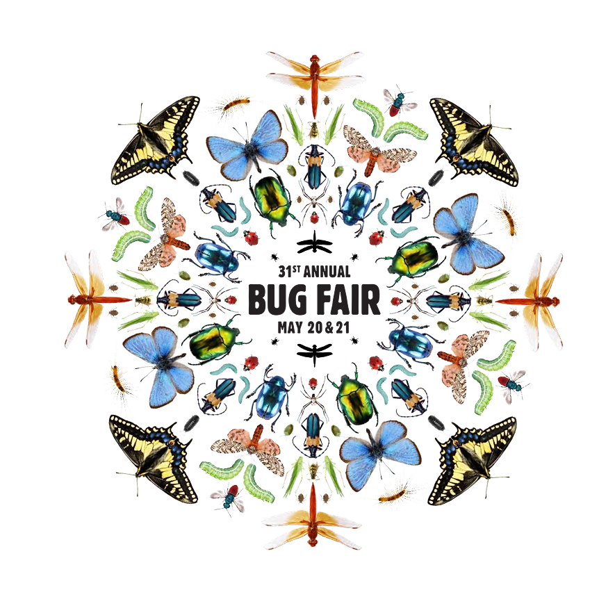
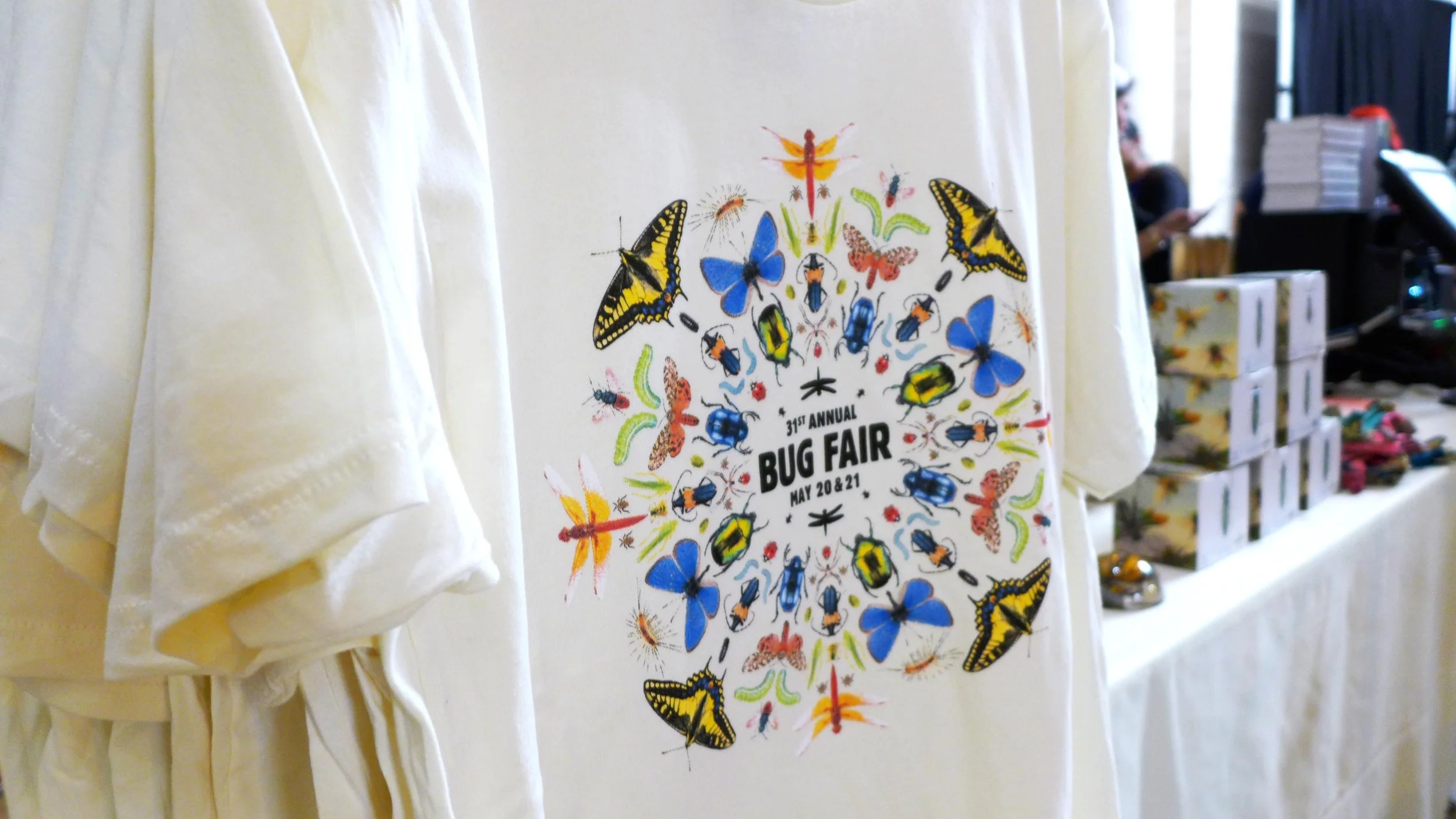
The challenge: represent the full diversity of insects in a single, cohesive image, bold and accessible enough for a broad public audience, while staying consistent with the museum's institutional identity.
The Natural History Museum's Annual Bug Fair is one of the largest public entomology events in the country. For the 31st edition, I refreshed the logo and developed key art extended across digital banners and merchandise. I used a mandala-inspired layout to bring different species together into one symmetrical composition, turning scientific variety into a visually compelling centerpiece. The event attracted over 13,000 visitors.
Identity & Key Art
Merchandise
Digital Placements
← PreviousAcademy Museum — Grand Opening
Next project →Reikiflo — Website Redesign
← Back to projects
Reikiflo
Virtual Wellness Website Redesign
Discipline
UX Research · UI Design · Prototyping
Industry
Health & Wellness
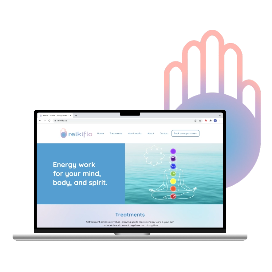
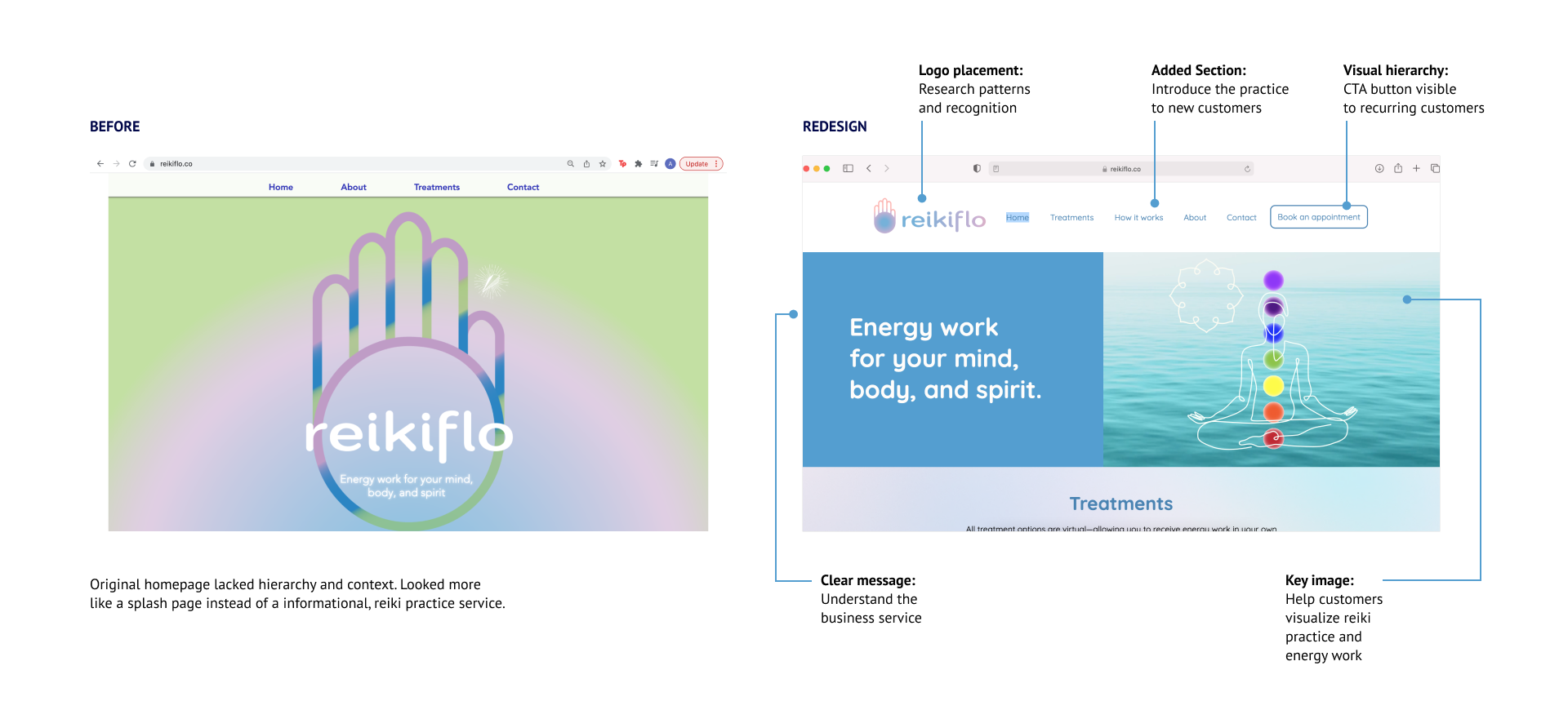
As demand for virtual wellness services grew, Reikiflo needed a redesigned website that could build trust with first-time clients unfamiliar with reiki, while giving returning clients a clear, efficient path to book follow-up sessions.
Reikiflo is a virtual reiki practice started during the pandemic. The existing website was not effectively converting new visitors or supporting repeat bookings. I led the end-to-end UX/UI process: competitive analysis, user research, persona development, user flows, information architecture, wireframes, visual design, and usability testing.
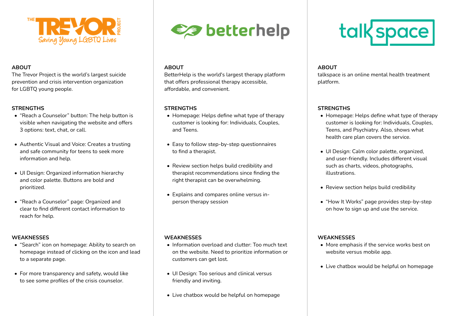
Research & Competitive Analysis
To understand where Reikiflo sits within the health and wellness space, I conducted a competitive analysis on three major mental health platforms, evaluating similar services and auditing usability strengths and weaknesses. I then interviewed seven potential users (ages 25–35) via Zoom to understand their motivations and frustrations when trying a new health practice and booking appointments online.
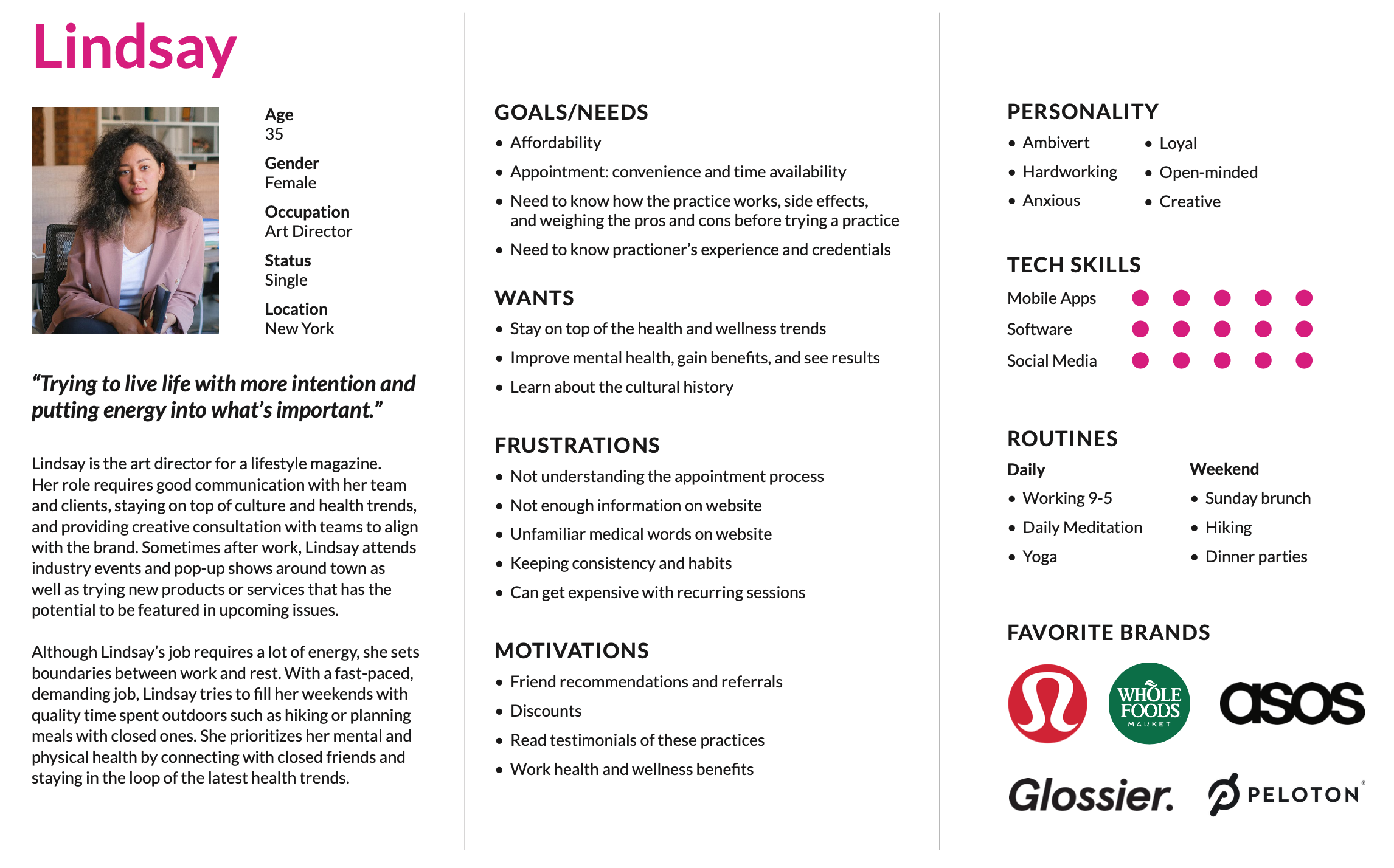
Persona & User Flows
After identifying pain points, I created an ideal client for Reikiflo: Lindsay, a busy professional who prioritizes personal growth and mental health. I mapped two key scenarios: a first-time visitor discovering Reikiflo through Instagram and booking a session, and a returning client booking a follow-up.
Information Architecture
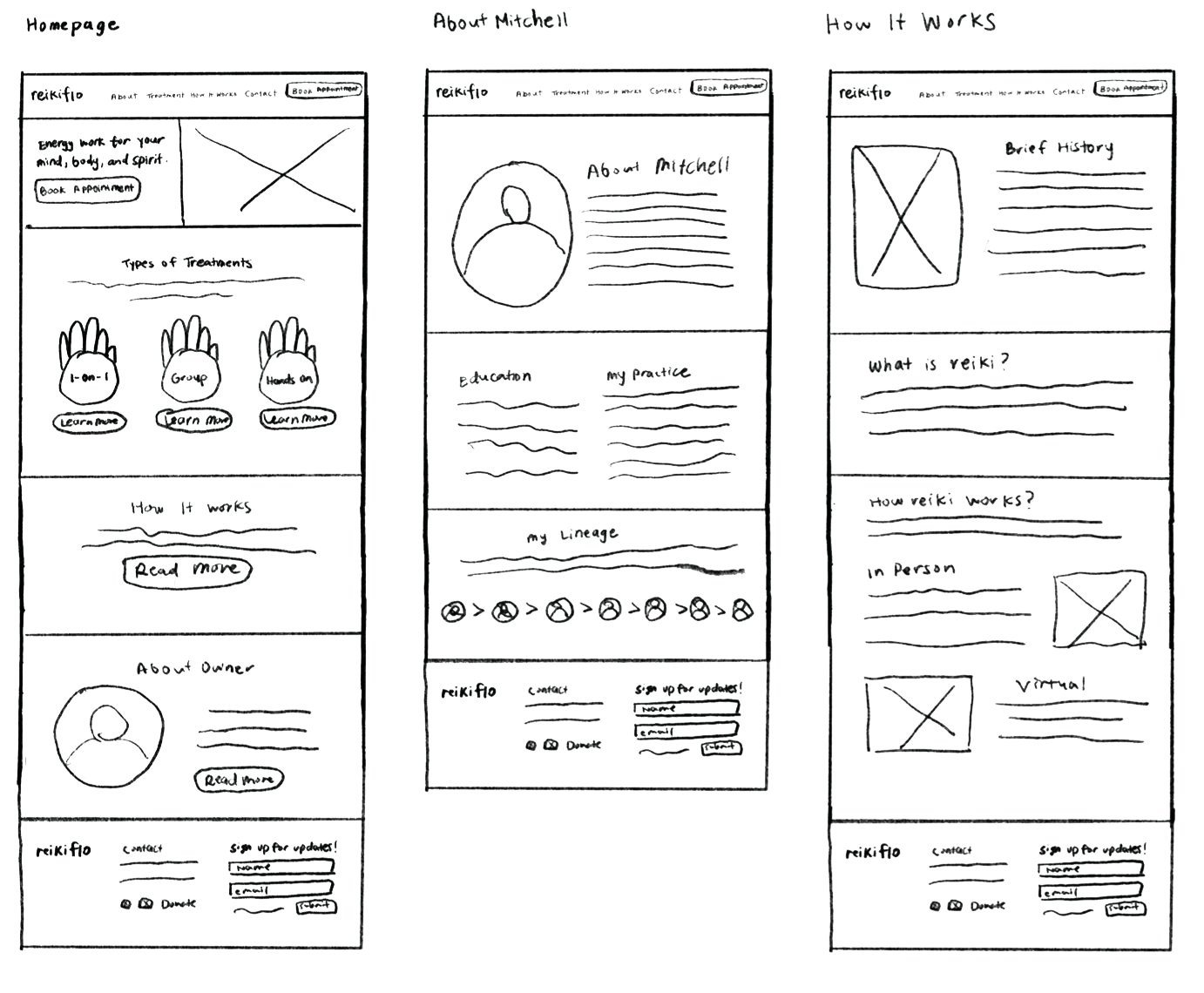
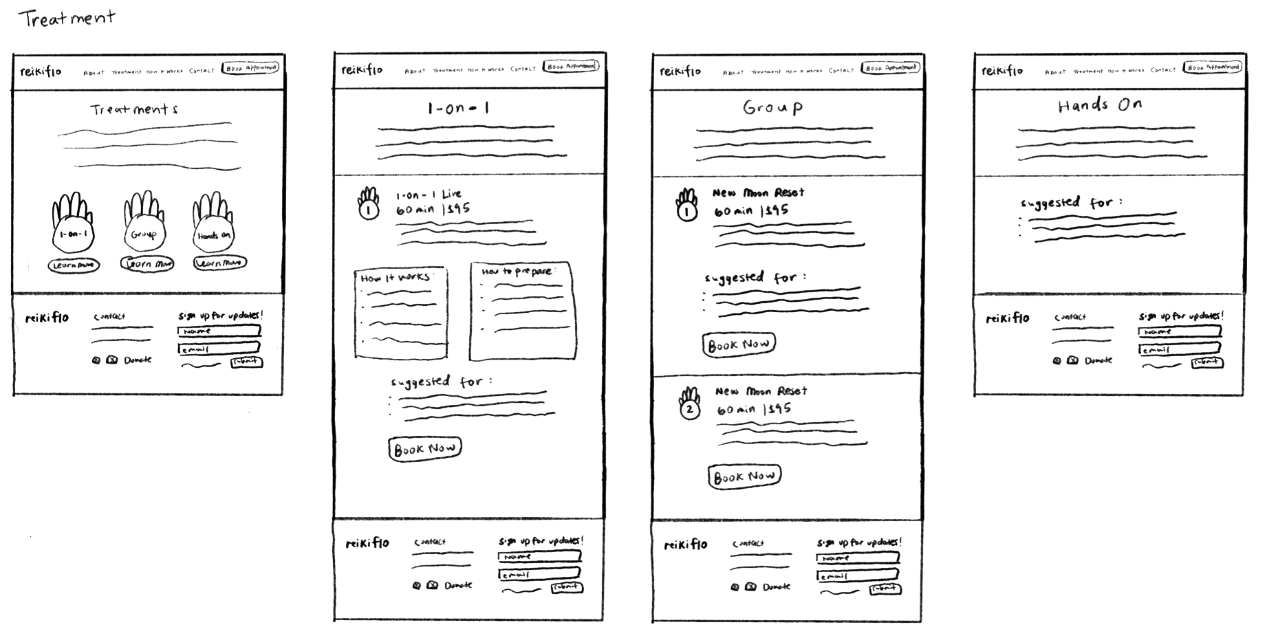
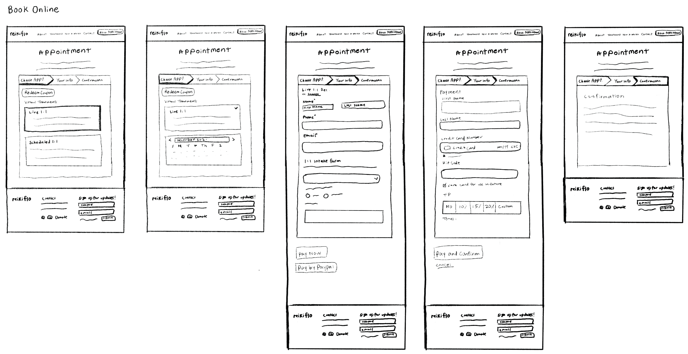
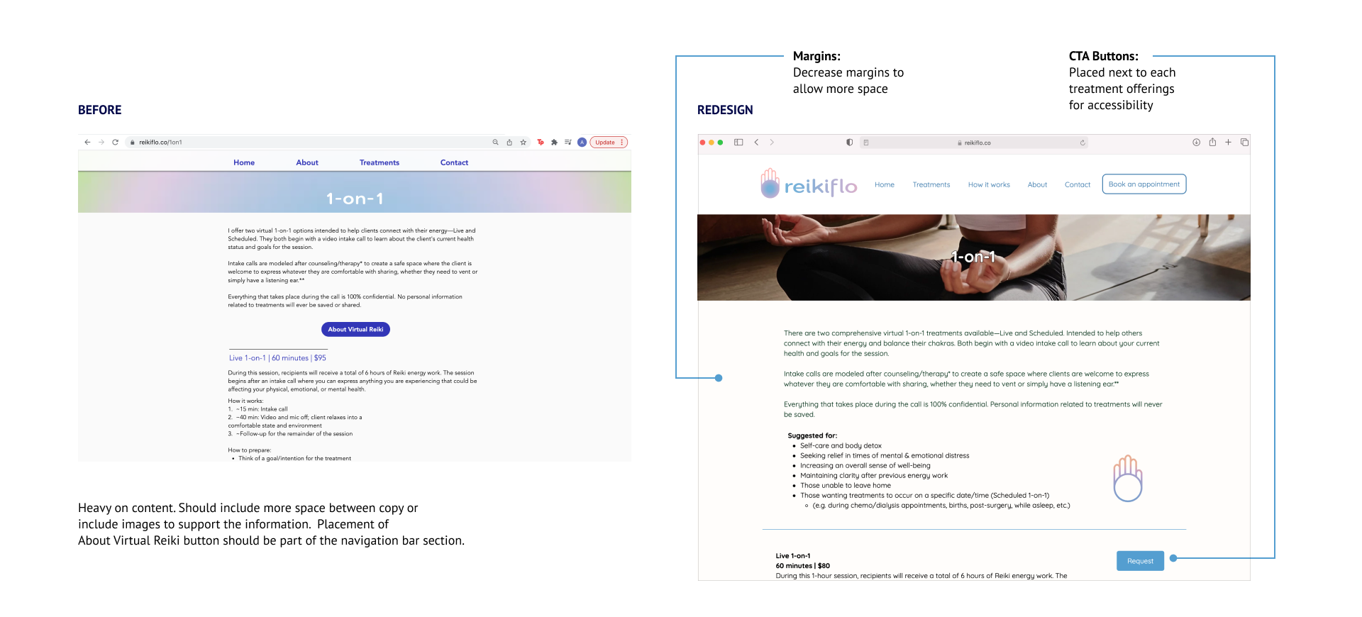
Wireframes
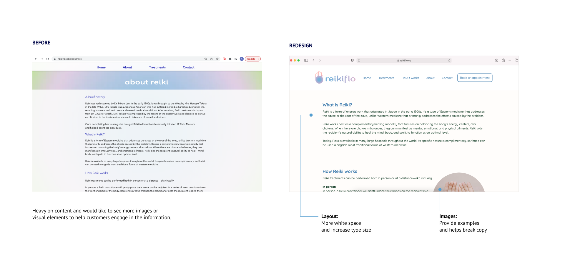
Homepage focuses on a general overview of the service. About Owner and History of Reiki pages are informational, adding more images helps break down content-heavy sections and improve engagement. The Treatment page is visually organized by session type (1-on-1 and group) using the hand icon from the logo. After speaking with the client, the booking system was outsourced and integrated with Squarespace checkout. The site is built on Wix, so wireframe sketches also accounted for the platform's build constraints.
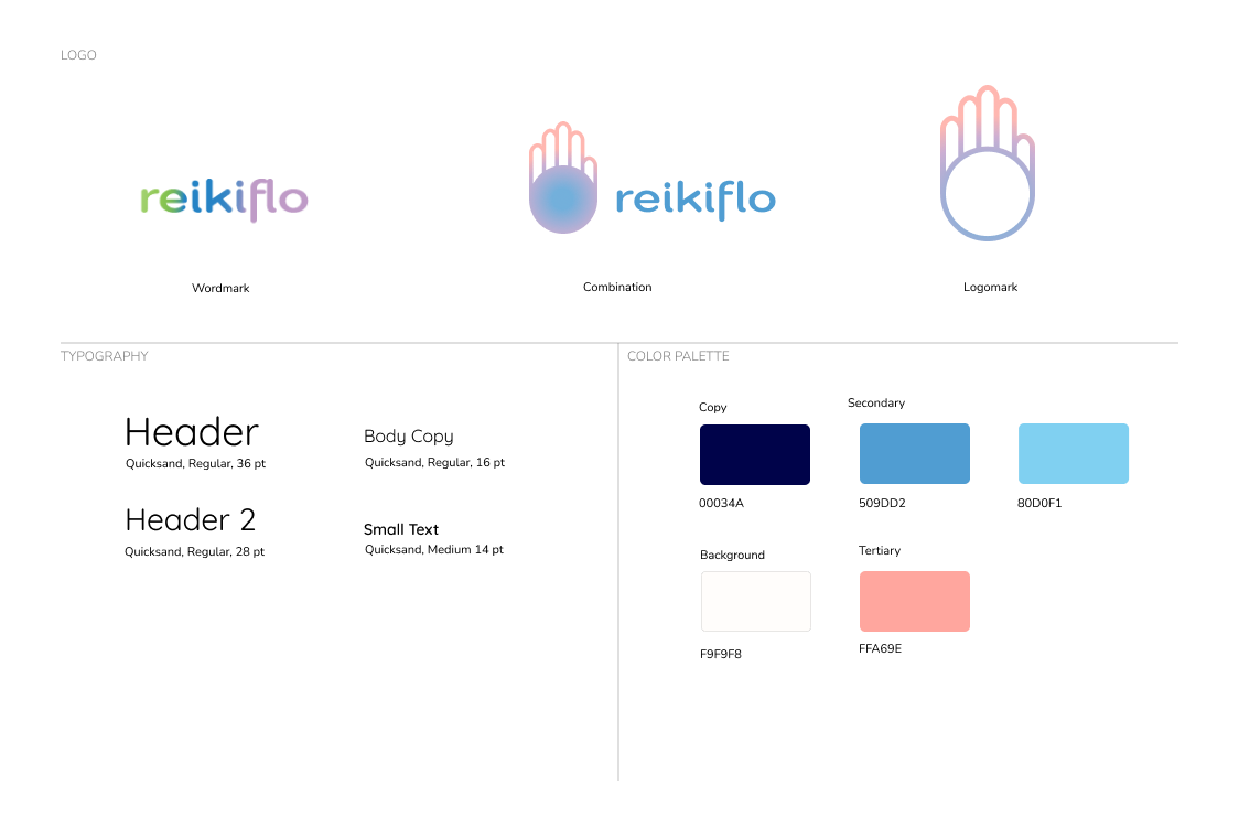
Style Guide
Drawing from market research and client conversations, I developed a design system rooted in the energy and fluidity of reiki practice. The color palette is calm and grounding, inspired by natural elements. The hand symbol references the energy points of the palm, a nod to the healing intention at the core of the practice.
Final Designs
Usability Testing
After designing the interface, I conducted a remote usability test to observe how participants navigate the site to book an appointment, specifically first-time users new to reiki wanting to book a group session. The client was happy with the redesign hand-off, noting it aligned with his vision for the brand in the health and wellness industry.
Test Goals
How easily users complete a task
Overall quality and flow
Observe any frustrations
Discover any user patterns
Participants — Ages 25–35
Open to trying self-care rituals
Interest in reiki
Book appointments online
Task Scenario
You are a first-time visitor new to reiki practice. Navigate the Reikiflo website and book a group session.
Successes
Easy to use and navigate
Easy to read and understand
Nice logo and illustration
Organized information hierarchy
Frustrations
More white spaces on Treatment Info pages
About Page: Lineage section — add external biography site links for reiki masters
Too much copy — how to make more engaging without breaking information
Depending on device, layout varies and some display more white space than others
Patterns
Read How It Works and About Me page first
Interested in the lineage section on the About Page
Takes most time on Treatment page because text heavy
Next Steps
Build out Privacy and Policy, Terms of Service pages